 Launchpad 27Every app on one screen, in your own folders, from a screen corner
Why a Launchpad of my own?
macOS 26 removed Launchpad and replaced it with an Apps view in Spotlight. I miss seeing all my apps on one screen, sorted into my own folders. There are many apps I rarely use, and I don't even remember what they're all called – so being able to search by name doesn't help.
The Apps view has no folders of your own and no order of your own. So I asked Claude Code to find out how the old Launchpad worked and build a new one.
Launchpad 27
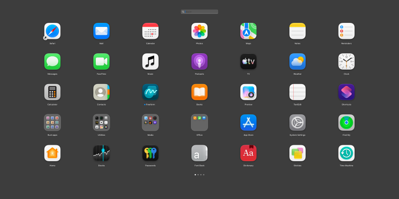
Launchpad 27 shows every installed app in a grid across the whole screen, with icon and name, over a blurred image of the desktop. I open it by moving the pointer to the bottom right corner, and the same movement closes it.
What the app does:
- arrange freely by dragging, also between pages: hold the app at the edge of the screen and the page changes
- folders: drag one app onto another and a folder is created, with a name suggested from the app's category. A double-click on the name changes it. The folder disappears when the last app has been dragged out
- search that is active right away: type, choose with the arrows, launch with Return
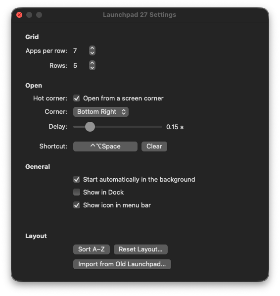
- several ways to open: screen corner, shortcut, menu bar icon or the Dock
- settings for how many apps per row and how many rows, so that everything fits on one page if you want
- start in the background at login, with no icon in the Dock
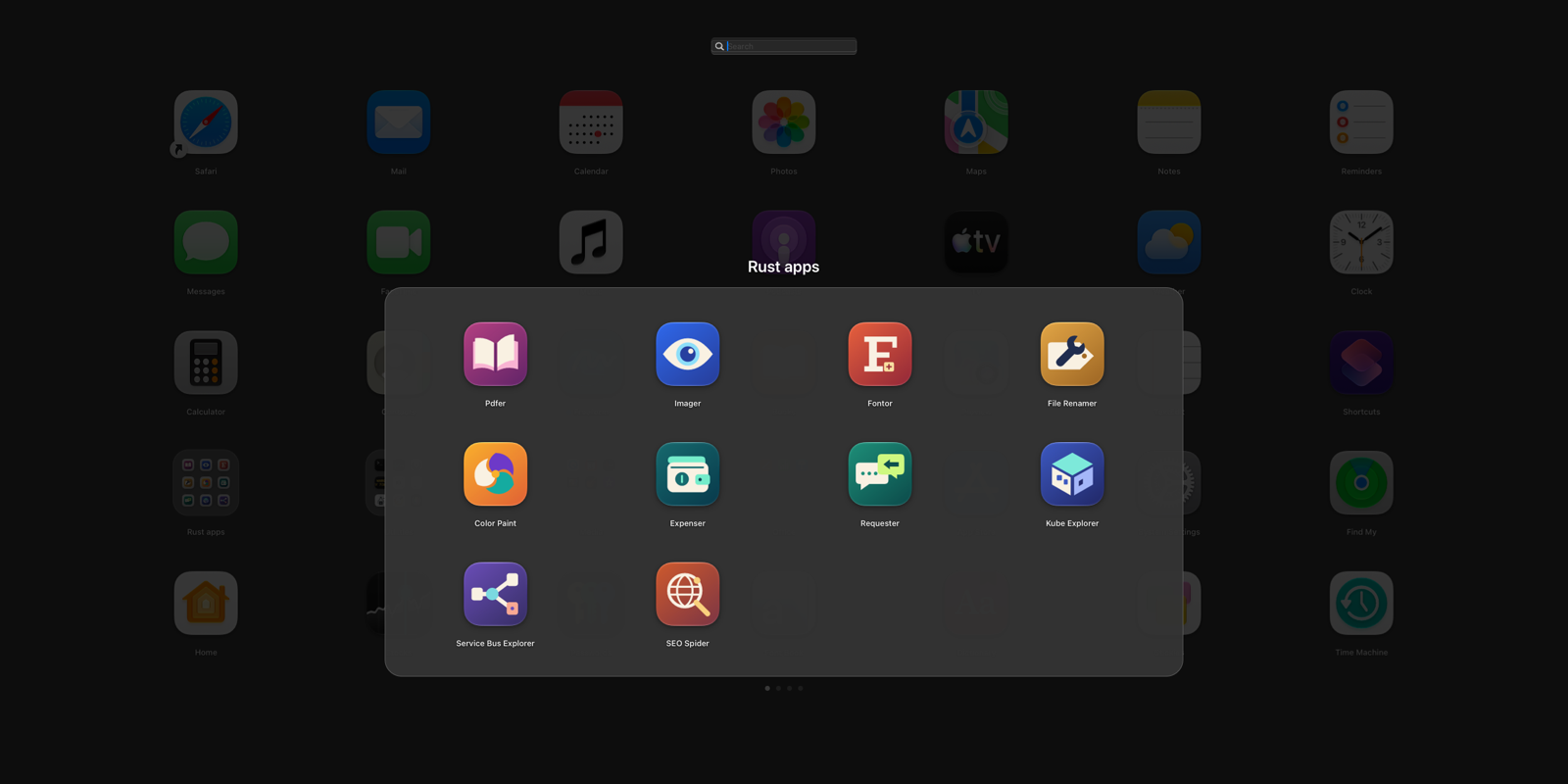
The first time the app started, I already had my folders. The old Launchpad's database was still on the computer after the upgrade, and Claude Code found it: ten folders and 133 of my 161 apps landed in their old places. The 28 added since then were put last.
The program is built with Claude Code, in Swift with AppKit, and the icon was made by Claude Code too. My other desktop programs are written in Rust, so I asked whether the language mattered. The answer was that no language is required, but that the app is almost nothing but calls to macOS's own functions, and those are easiest to reach from Swift. It's built without an Xcode project, with Swift Package Manager and a build script.
Two decisions carry the rest. The first is that the app shouldn't need any permission in System Settings. macOS has no way of adding your own action to a screen corner, so the app watches the pointer itself, and that can be done without permission as long as it only looks at mouse movement. The second is that the rules for the layout live in a part of their own with no window, with 86 tests: what happens when an app is dropped on another, when a folder is emptied, when the grid changes size.
The work was run from an issue board, as in my other projects. Claude Code tried each part against the built app with real mouse clicks, drags and key presses, and put up issues of its own for me for the things that can only be judged with a hand on the trackpad.
Along the way
The old layout looked wrong at first. The database seemed to contain 197 apps on 15 pages. That wasn't right: the file was read without its log, and the rows being counted didn't belong to what was visible. With the log read in, everything was on a single page, 158 apps. The app now reads a copy of the database, with the log, and never touches the original.
A test changed a system setting. One of Claude Code's test scripts was meant to click the button for the shortcut and addressed it as "button number one" in the window. That was a different button, the one that turns off macOS's own action in the screen corner. It was restored right away, and the tests now address buttons by name.
F4 was a bad shortcut. The old Launchpad sat on the F4 key, so that was the default at first. But a shortcut that applies across the whole system takes the key from every other program, and F4 means "jump to source" in Rider. It became ⌃⌥Space.
Tiny pages when the grid shrank. When I stepped the grid from 7×5 to 5×4, my two pages became five: 20, 5, 5, 5 and 20 apps. Every step put the overflow on a page of its own. Now the pages are refilled from the start when the size changes, so a larger grid gives fewer pages.
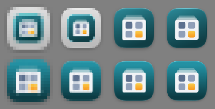
The icon on a grey plate. In lists and in the Applications folder the icon was shown shrunk on a light grey plate. Nothing was wrong with the icon file. Since macOS 26 the system does that with icons in the old format, at the two smallest sizes even when the shape is right. The fix is to have the icon in Apple's new format as well. The same turned out to apply to all ten of my Rust programs.
I misspelled the name. The app was called "Lauchpad 27" for five versions before I noticed. The rename went through everything, and the new version takes over the layout and the settings from the old one by itself.
Compared with Apple's Apps view and other replacements
Apple's Apps view comes with the system and asks for nothing, but has no folders of your own and no order of your own.
There are several replacements. LaunchNext and LaunchNow are open source and also written in Swift. AppGrid, LaunchOS and Launchie are commercial. What they do that Launchpad 27 doesn't, according to their own descriptions: LaunchNext has the pinch gesture on the trackpad and lets you drag apps to the Dock. The pinch gesture requires a private interface in macOS, and I didn't want to build on that.
What Launchpad 27 doesn't do that the old Launchpad did: uninstall apps, show badges and download progress on the icons, and page through large folders – a large folder shrinks the icons instead.
What Launchpad 27 gives me:
- my old layout, imported
- no permission to approve, and no private interfaces
- exactly the settings I want, and no more
- an app I can change the same day I miss something
Try it yourself
Under Files you'll find IDEA.md: a complete description of the program and everything I learned during the build, written as a brief. Give it in full to Claude Code and you have the groundwork for a Launchpad of your own – the stack, the decisions that turned out to matter, the pitfalls above written as rules, and a ready-made prompt to start from.